Wednesday, December 4, 2013
Thursday, November 14, 2013


Monday, November 4, 2013
poster
What makes a good poster...?


Rule 1: Define the Purpose
Rule 2: Sell Your Work in Ten Seconds
Rule 3: The Title Is Important
Rule 4: Choose your colors wisely
Rule 5: Many of the Rules for Writing a Good Paper Apply to Posters, Too
Identify
your audience and provide the appropriate scope and depth of content.
If the conference includes nonspecialists, cater to them. Just as the
abstract of a paper needs to be a succinct summary of the motivation,
hypothesis to be tested, major results, and conclusions, so does your
poster.
Rule 6: Good Posters Have Unique Features Not Pertinent to Papers
Rule 7: Layout and Format Are Critical
Rule 8: Content Is Important, but Keep It Concise
Rule 9: Posters Should Have Your Personality
Rule 10: You of all people should be proud of your finished product


We are all responsible to creating an eye catching/informative poster that announces we are having a yearbook cover design contest . We want it to involve the whole school not just art students.
Friday, October 11, 2013
Halloween Cards
As you know we need to raise money to help pay for the yearbook. Our first fundraiser other then selling ads is going to be a Halloween card sale along with candy. Students may purchase candy and a card ( designed by you) for one dollar during each lunch period.
You are all responsible for creating 10 cards each. 5 homemade cards and 5 digital cards created in Photoshop. Remember you are CREATING your own design do not steal your images off the internet. If you use a picture form the internet make sure you transform it completely to make it your own. If you do not that is considered PLAGIARISM !!
Make these fun, silly and scary


 Please use markers, colored pencils, magazines, construction paper and your imagination. You may use anything you want in the TAN filing cabinet.
You are all responsible for creating 10 cards each. 5 homemade cards and 5 digital cards created in Photoshop. Remember you are CREATING your own design do not steal your images off the internet. If you use a picture form the internet make sure you transform it completely to make it your own. If you do not that is considered PLAGIARISM !!
Make these fun, silly and scary


Monday, September 23, 2013
logo and color theory
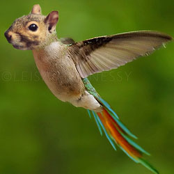
Each of you will be selecting a logo that already exist and you are going to improve it using Photoshop. We have gone over all of the elements and principles of design, make sure you are using these concepts in your design.
Requirements for this assignment are :
Create a new logo in Photoshop
Show all previous logos from past decades of your product
Explain why the logo today is uncusseful in your eyes
Explain why your new logo is more successful.
We will be watching a video on how to create a logo.
Requirements for this assignment are :
Create a new logo in Photoshop
Show all previous logos from past decades of your product
Explain why the logo today is uncusseful in your eyes
Explain why your new logo is more successful.
We will be watching a video on how to create a logo.

Thursday, August 29, 2013
Good/ Bad Photography
It is not about the subject matter.
It is about the COMPOSITIONAL layout. ANYTHING can be an interesting subject matter.
A viewers eye path is very important. Your viewer will first be attracted to the brightest subject in your image, once they have found the image you want their eye to travel around the photograph, but not out of the frame.
Lighting can also make or break a photo. 


Objective: you and a partner will travel around Vermilion high school and take photos of all elements and principles of design. Make sure you are conscience of what makes a good photo and try
Wednesday, August 28, 2013
Element and Principles of Design
Just because you have a graphic design computer program on your computer does not mean you are a graphic designer. You first need to understand the principles and elements of design in order to create something pleasing to the eye.
Please get out your handout from yesterday as we watch the video on discovering which elements and principles are used being used.
Along with the Elements and Principles of design you as graphic designers need to be able to pick out a good photo from a bad photo and also need to be able to capture a good photo. Below are examples of both good and bad photos.
Lets talk about what we see.
Subscribe to:
Posts (Atom)